I have been wanting to do a tutorial series on basic pattern draping and drafting for some time now.
There is a lot of information involved and I wasn’t sure how to break it all down and it seemed like such a big job. But needed.
So today I present to you:
DRAPING AND CREATING A BASIC BODICE SLOPER: THE FRONT
What is a sloper if you don’t already know? A master pattern from which you can create many other designs from. Pretty awesome.
First I’d like to tell you a little bit about my background in pattern making, and how I originally learned to make them.
When I went to FIDM to study fashion design in the early nineties there were some very good teachers who came from a time when things were still made beautifully, with lots of attention to construction details.
One of my intructors:
Connie Amaden Crawford. If you are interested in fashion draping Connie Amaden Crawford is the author of the quintessential draping textbook, The Art Of Fashion Draping. ( affiliate link) She has several books on pattern making, draping, pattern grading, fitting, and also a pattern line available through her website and Amazon if you would like to learn more about her.
Ms. Crawford was an exacting teacher and I learned a lot in her classes, although at the time I thought she was maybe too demanding. I stayed up many a night trying to get things just right for her class. She taught me pattern drafting, and pattern grading.
My draping teacher was actually an elderly gentleman who always wore a suit and a pocket square with beautiful brushed back silver hair. He was very elegant and I wish I could remember his name as he worked at some very high end companies back in the fifties and sixties. Anyway, I was very well prepared when I later went on to work in the industry briefly after graduating. And even though I stopped working to be a stay at home mom, many of the foundational lessons I learned in those basic classes were ingrained as I came back to making clothes after too many years away.
I’ve been going through many of my old notes I found and textbooks to try to put something together I can present to you as a tutorial here on the blog.
Do you have a dress form and aren’t sure how to use it yet?
Once you have a few basic blocks created, designing is quite simple.
Let’s get started!
What do you need?
A dress form
pins
fabric
scissors
a tracing wheel
A quilter’s ruler.
a pen
paper ( I use freezer paper sometimes)
a cutting mat if you have one( helps with tracing lines.)
1. When draping a basic block, we drape only one half of the form. Later, we will cut out both sides to test the fit. But for now to drape the front, you will need a piece of fabric about 5 inches longer then the neck to waist on the form, and 5 inches wider than the center front to side seam. Before you start pinning the fabric on the form draw the CROSS GRAIN LINE near the middle of the fabric. Lay that on the form across the bust line and mark the APEX, or bust point. Pin the fabric at the apex, the center front waist, neck and apex points, making sure the fabric is on the STRAIGHT GRAIN and 45 degrees across on the center front all the way to the side seam arm plate.
2. Next, drape the waist dart. Clip the fabric at the princess line almost to the waist line.The line going straight down on the form between the CF (center front) and side seam is the PRINCESS LINE.
3 & 4. Pin at the side seam and center front waist points. First, make sure the fabric is falling correctly from the side seam armplate. It should hang straight down, not looking crooked.Smooth the fabric at the waist over from the center front waist and put a pin at the princess line. Now smooth the fabric over from the side seam waist to the princess line/ waist point. The fabric will gap because of the bust and that extra fabric will form the front waist dart. Fold the excess over and pin it shut. The bigger the bust, the bigger the dart!
BTW my dress form is wearing a bra because it’s the same measurements as me except for there, so I padded it out with my bra. I do have a tutorial for padding your dress form if you find you are a little too curvy for it. My waist is a tiny bit bigger, and my shoulders are more narrow so when I make my final muslin, I will fit it on myself and make a few small adjustments. To see my blog on customizing your dress from click here.
5. Pin at the side seam armplate and smooth the fabric up and over the armplate towards the neck. Draping feels like sculpting, smoothing things carefully, then pinning them.
6. Use your pencil to trace the side seam, waist seam and neckline. Clip into the fabric at the neckline to smooth out the neckline drape. Now pin at the shoulder armplate point and pin the excess fabric that has gathered up there between the should arm point and neck point into another dart on the princess line. Pin it closed. Mark the armplate screw and the middle of the armplate between the shoulder and side seam. Make sure you mark the spot where each dart ends as well as each dart leg.
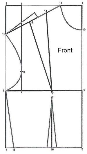
7& 8 .TRUE UP meaning draw lines in with a ruler, your rough lines you made on the dress form.
You are probably wondering what the deal is with that shoulder dart about now, right? Will you have a weird dart at your shoulder ? Nope. We are going to slash the pattern and pivot the dart excess into the bottom dart. Another method is to pivot the shoulder dart into the armhole. Some designs need you to use a two dart basic bodice sloper as your foundation, and some need a one dart sloper as a foundation. Today we are making a one dart sloper. …
REDRAW the dart, ending it at the apex on the crossgrain line. Keep the dart the same at the bottom of the dart legs.
Now… iron your fabric pattern, and tape it to paper. If you have a cutting mat place it under the fabric between it and the paper. Use your TRACING WHEEL to trace the pattern lines. When you remove the fabric, you will see all of the little dots impressed in the paper and will need to trace them with your pencil and ruler, making sure to trace in the new darts. My camera couldn’t pick up the details. They are hard to see.
9. Above is my traced and trued pattern piece. To move the shoulder dart, cut through the CENTER of both darts until almost touching the apex. Pivot the top dart closed. The bottom dart will automatically become wider! COOL, isn’t it!? Once my dart was closed and my bottom dart got really big, I patched it from behind with some scratch paper. See number 13 below.
10. SQUARE the edges of the pattern. I show this before I changed the dart but it doesn’t matter.
11. Time to add some FUNCTIONAL EASE. This keeps you from feeling like you are wearing an Elizabethan corset. Minimum ease recommended in the bust area is two inches for comfort. Also now is the time to lower the armhole a bit, too. Make a mark one inch under the armhole and 1/2 inch out from the side seam. Redraw your armhole. If you have a FRENCH CURVE ruler, it’s very helpful. I couldn’t find mine so I just drew it free hand. Now you can lower your neckline about 1/4 inch as well.I also added 3/8 inch seams all around the pattern.
12. To finish the dart you redrew you will need to fold the dart closed and cut along the seam line you drew at the waist. When you open it , it will look like a typical dart.
So there is my rough front bodice sloper. Join me tomorrow to see how the back bodice is made.
Then I will make a final muslin, work out any kinks and transfer that to Manila paper.
If you have any questions leave a comment!
RESOURCE: Sew Country Chick. Sign up for an e mail subscription here!
Happy 2016, Art Club!!
I hope that you are just as excited as I am to get started on the artwork for our Annual Student Exhibition in May.
As you should know, our theme this year is,
Appropriation: Art of the RE-Purposed & RE-Imagined.
WHAT IS APPROPRIATION?
Appropriation is the intentional borrowing, copying, and alteration of preexisting images and objects. It is a strategy that has been used by artists for millennia, but took on new significance in mid-20th-century America and Britain with the rise of consumerism and the proliferation of popular images through mass media outlets from magazines to television.
Pop artists like Robert Rauschenberg, Claes Oldenburg, Andy Warhol, Tom Wesselman, and Roy Lichtenstein reproduced, juxtaposed, or repeated mundane, everyday images from popular culture—both absorbing and acting as a mirror for the ideas, interactions, needs, desires, and cultural elements of the times. As Warhol stated, “Pop artists did images that anyone walking down the street would recognize in a split second—comics, picnic tables, men’s pants, celebrities, refrigerators, Coke bottles.” Today, appropriating, remixing, and sampling images and media is common practice for visual, media, and performance artists, yet such strategies continue to challenge traditional notions of originality and test the boundaries of what it means to be an artist. read more here
Debate. Andy Warhol famously said that “everyone is an artist.” With a friend, debate Warhol’s claim. Do you agree or disagree, and what reasons do you have for your opinion?
Reflect. Create a list of criteria for art.
2. Alter an Advertisement
Find an image on a billboard or in a magazine, photograph it, and import it into Photoshop or another image processing software. Manipulate the image by cropping, adding text or images, or changing the color. See what kind of statement you can make. Give this new piece a title and show it to a friend.
3. Rauschenberg & Co.
Rauschenberg said, “Painting relates to both art and life…. I try to act in that gap between the two."
Discuss. What does Rauschenberg mean by “the gap”? Converse with a friend.
Research. What other artists embrace Rauschenberg’s ideas about the relatedness between art and life? Find and research other artists who embrace Rauschenberg’s ethos. List 3-4 artists, and the ways in which they reflect Rauschenberg’s quote.
4. Transform an Object
Select. Find an everyday object (that represents where you live right now).
Make. Transform this object into your own artwork using a mix of media, including nontraditional art materials. Before starting, make a sketch to plan your work. You will need to consider:
What is your object’s cultural relevance or meaning?
How do you want to celebrate or change or critique that object’s meaning?
What materials will you use?
How big will the work be?
EXAMPLES of our THEME
MAKE YOUR CHOICE AND BEGIN TO DO SOME
RESEARCH AND SKETCHING IN YOUR SKETCHBOOKS
Materials, Re-used, Up-cycled, Re-Imagined
TRASHION - the art of using otherwise discarded material
to create contemporary fashion
A.k.a Iri5, Erika Iris Simmons specializes in using non traditional media like cassettes to create absolutely unique and memorable works that feature famous people or team like Kurt Cobain, Beatles and Michael Jackson. Ghost In The Machine – Michael Jackson. (Image Source: iri5)
Copyright protects the creative expression of an idea, but never the idea itself. Copying ideas is always allowed, but copying expression is generally prohibited. However, copying expression will still be allowed if the copy is fair use. Exploring some copyright and appropriation art cases can help solidify these nebulous concepts.
Fair use comes up in many types of copyright cases, but “appropriation art” cases are often the most interesting. In appropriation art cases, some creative expression has been copied, but the copying will not be infringement if the new art transforms the original. If the secondary use adds value to the original–if the quoted matter is used as raw material, transformed in the creation of new information, new aesthetics, new insights and understandings—then it’s type of activity that the fair use doctrine protects for the enrichment of society. Toward a Fair Use Standard, Pierre Leval.
Copyright law doesn’t give us clear-cut rules like “using less than 10% of an original is fair use” or “copying less than 8 seconds of video is OK.” The actual fair use rules are subjective and imprecise. Reviewing some examples can help give you a feel for the rules.
Contents:
Fair Use: Sorry for Partying
“Sorry for Partying” is an easy win for fair use. “The photograph was posterized, the background was removed, and Soglin’s face was turned lime green and surrounded by multi-colored writing… almost none of the copyrighted work remained.” Kienitz v. Sconnie Nation (7th Cir. 2014).
Sorry for Partying was fair use because it used only a sliver of the original photo. However, fair use isn’t just about the amount of art copied. Fair use weighs four central factors: (1) is the copy transformative or non-commercial? (2) Was the original work factual or creative? (3) How much was copied? (4) Does the copy harm the market for the original work?
Keep these questions in mind as you look at the next images.
Fair Use: Parody for a Movie Poster
Photoshopping Leslie Nielsen’s face onto the famous photo of a pregnant Demi Moore was fair use as a parody, despite being a commercial movie poster:
Plainly, the [Nielsen photo] adds something new and qualifies as a “transformative” work. … Because the smirking face of Nielsen contrasts so strikingly with the serious expression on the face of Moore, the ad may reasonably be perceived as commenting on the seriousness, even the pretentiousness, of the original. Leibovitz v. Paramount, 137 F.3d 109 (2d Cir. 1998).
While the commercial nature of a new work tends to weigh against fair use, a transformative work weighs in favor of fair use, and often with more force. Now let’s look at another case involving movie posters: the monster movie art of Basil Gogos.
Fair Use in Famous Monsters
Spurlock copied plaintiff’s “Famous Monsters” magazine covers without modification. They are even closer copies than the Naked Gun poster above. They’re still fair use, but this time for a different reason. The copies of Gogos’ art are not parodies or appropriation - they are copies for criticism and biography.
Basil Gogos created significant and highly detailed art. The purpose of his art was to promote movies and sell magazines. The copies were made for “an entirely different purpose” - a biography of Gogos the artist. Defendant’s copies pay homage to Gogos’ artistic accomplishments. “The book also provides commentary from many respected individuals in the movie monster industry who attest to the quality of the work and his lasting legacy.” The copies were fair use. Warren Publishing v. Spurlock, 645 F.Supp.2d 402 (EDPA 2009).
Infringement: Blue Puppies
The Jeff Koons sculpture (right) infringed the original Art Rogers photo (left). It was not fair use. The Koons work had a commercial purpose (he sold it for $376,000), it copied from an artistic (rather than factual) source, and Koons copied nearly every detail of the original. Koons’ argued that his sculpture was satire that criticized societies’ fascination with mass-produced commodities, and should therefore be considered fair use. The Judge disagreed, deciding that copying an artists’ work to criticize society at large was not fair use — to be fair use the copy must criticize the original work. Rogers v. Koons 960 F.2d 301 (2d Cir. 1992).
Note that this rule was overturned in Cariou v. Prince 714 F.3d 694 (2d Cir. 2013), “The law imposes no requirement that a work comment on the original or its author in order to be considered transformative…”.
No Infringement: Mountain Lion Statue
A mountain lion statue was not infringing a very similar photograph. This is not a case about fair use. The sculpture was not transformative. Both the original photo and the sculpture shared the same artistic intent - to display the protective nature of a mother mountain lion. However, the sculpture only copied the non-protectable elements of a mother mountain lion carrying her cub. According to the court, these were elements found in nature rather than elements resulting from the original photographer’s creative expression:
In this case, however, all of the similarities in expression between the two works at issue consist of unprotectable elements or themes that flow predictably from the underlying subject matter. Dyer v. Napier (D. Ariz, 2006).
Fair Use: Collage of Advertisements
Photographer Andrea Blanch took the original photo (left) and published it in Allure Magazine. Jeff Koons used the photo in his “Niagara” painting (right). A New York court decided the Koons painting was transformative because:
The use of a fashion photograph created for publication in a glossy American “lifestyles” magazine — with changes of its colors, the background against which it is portrayed, the medium, the size of the objects pictured, the objects details and, crucially, their entirely different purpose and meaning — as part of a massive painting commissioned for exhibition in an art-gallery space. Blanch v. Koons (2d Cir. 2006).
Cariou v. Prince Lightning Round
This case involved 30 works of Richard Prince’s art, each using different amounts of Cariou’s original photography. The appeals court decided 25 were clearly fair use, and 5 were too close to call. Cariou v. Prince, 714 F.3d 694 (2d Cir. 2013). Let’s look at some examples:
Fair Use:
Close Call:
Fair Use:
Close Call:
The appeals court sent the five “close call” works back to the trial court for further analysis, but Cariou v. Prince settled out of court before the fair use issue was decided.
Infringement: Quilt Briefly Decorates TV Set
Showing a quilt in the background of a sitcom for 27 seconds is copyright infringement. The quilt was a highly creative work, and its appearance in the sitcom, though brief, was not transformative. The purpose of the original quilt was to decorate and depict African-American church culture. The purpose of the duplication was to decorate an African-American church set in a TV show. Ringgold v. BET 126 F.3d 70 (2d Cir. 1997).
Infringement: Mayor McCheese
Mayor McCheese infringed H.R. PufinStuf. The court noted that “the ‘Living Island’ locale of Pufnstuf and ‘McDonaldland’ are both imaginary worlds inhabited by anthromorphic plants and animals and other fanciful creatures… The characters are also similar. Both lands are governed by mayors who have disproportionately large round heads dominated by long wide mouths.” Krofft v. McDonalds, 562 F.2d 1157 (9th Cir. 1977).
McDonalds tried to avoid copyright infringement by highlighting some trifling details differentiating McCheese from PufinStuf. It didn’t work:
We do not believe that the ordinary reasonable person… will even notice that Pufnstuf is wearing a cummerbund while Mayor McCheese is wearing a diplomat’s sash. Krofft v. McDonalds.
I’m not sure why the case looks at the cummerbund while ignoring the fact that MAYOR MCCHEESE’S HEAD IS A GIANT HAMBURGER
___________________________________________________
"Artist Jason Levesque was down in Miami last week, wandering around Scope art fair, when he noticed something: work by an artist named Josafat Miranda that looked exactly like his own. Miranda had taken photographs shot by Levesque years ago and painted them nearly to a tee — recreations with added color and flair. He had done the same thing with some photos shot by Marie Killen. Miranda’s pieces were being sold for $4,000 a piece at a gallery booth at Scope.
Levesque didn’t say anything at the time, but a few days later, he lined up the pairs of images side by side and posted about it on Tumblr. The post went viral, newspapers picked up the story, and the repercussions for Miranda were swift: within days, Robert Fontaine Gallery had pulled his work, canceled his pending sales, dropped him from its roster, and denounced him."
A Miranda-Killen comparison (click to enlarge)
A side-by-side comparison that Jason Levesque made of his work and
Josafat Miranda’s (click to enlarge) (all images via Levesque’s Tumblr)